I need to decide on the cover art. I just designed two covers based on the concept I had. Here's the idea, or perhaps I should say, here
was the idea. I wanted a picture where both my arms were up, my right hand forming a "V" and my left hand clutching a few CDs. The "V" would form the first letter of the word Vastater. The image of me would be warholized in some way, and my arms would go up either side of the hole on the CD. Like I said: that
was the concept.
This weekend I was out on a balcony in midtown Manhattan with the whole city beneath me. It would have been a great background for the picture I wanted to get. The only problem was finding someone who could take the picture. I ended up with a lot of bad, blurry, or otherwise poor-looking photos. There was only one picture that I thought I could salvage.
Here's the original picture:

Graphics are the bane of my existance. I don't have any real graphic programs other than Picasa, Paint, a picture resizer and the CD cover maker program. I can't ever seem to do the things I want to do. Here's what I would have prefered to do with the picture below. I wanted to invert the background so that it's white instead of black, and distort my own colors so I look orange. I got the orange part to work, but not the rest. This cover is going to suck for a number of reasons: black backgrounds never come up good. Also, the Astron Boy font is too delicate to show up well on a CD label printed on an inkjet printer. But here's what it looks like.

I removed the "The" in "The Vastater" because I didn't like the way it looked near "The Mennu Method." Then I tried to invert the colors, but instead I got an embossed image.

Again, if I could figure out how to make the backgound white instead of grey, I'd be in much better shape. If I could find a font that would look more embossed it would be cooler. Wait, I think I have one. Let's have a look:

It still looks like crap but I need to do a little work on the mixing, and really, I just want to go to sleep. Maybe I can get another photo tomorrow. Maybe I should turn off the computer and watch the end of the football game.
 This is me at work.
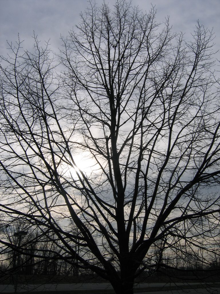 I took this picture on my way into work today. I was thinking that maybe the CD cover could have a bare winter tree with an overcast sky in the background as a cover.
